Color of the Year picks are a way for companies to get a little attention,…
Read More →
Students toured the fall market to learn more about the industry and take part in…
Read More →
Sean Veit has been named chief commercial officer of Industrial Automation and vice president of…
Read More →
When speaking with product designers at High Point Market, one trend kept coming up in…
Read More →Color of the Year picks are a way for companies to get a little attention, but taken together they tell a tale about what’s happening in home interiors.
By Julie A. Palm
Every year, as Mother Nature starts to put on her colorful autumnal display, purveyors of paint and wallpaper join others in the home furnishings industry for a cascade of Color of the Year announcements. Both the trees outside my home office and the news releases in my email inbox are awash with beautiful hues.
Color of the Year picks are a way for companies to bring a little attention to themselves. But taken together and combined with input from interior designers, product designers and other forecasters, they can give lighting showrooms insights into broader interior design trends to help make buying decisions.
Providing additional context, the brands increasingly release coordinated palettes around their Color of the Year choices. (Jennifer Bringle, editor-in-chief of our sister publication Casual News Now, delved into Sherwin-Williams’ 2027 Colormix Trend Forecast last week).
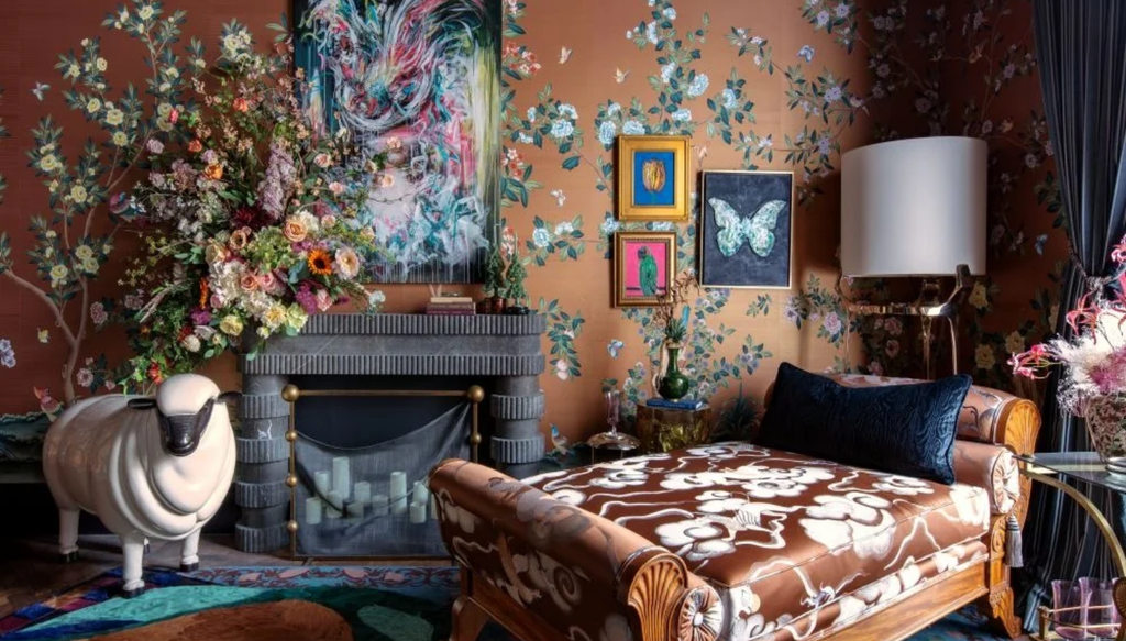
Every year, the big announcements that come from paint and wallcovering companies tend toward neutrals or colors – like greens and blues – that can read as neutrals. That makes sense for wall and trim hues, and this year is no exception. More than a dozen Color of the Year picks have been released thus far, and they are largely grouped around rich, grounding browns, blues and greens — some with smoky or plumy undertones, in a continuing move toward a warmer home palette.
Warming up
For example, Little Green named Marle its color for 2027. The luxury paint and wall coverings company chose a mid-tone brown with yellow and black undertones.
“Often dismissed as being a little dull, it’s wonderful to see browns being embraced and recognized as warm, earthy and indulgent shades that are perfect for delivering restful spaces that radiate balance and tranquility,” says Ruth Mottershead, creative director for the brand. “We have seen a shift; colors are becoming more balanced, neither too cool nor too warm! If they were to sit on the PH scale, they would sit at 5 or 6.”
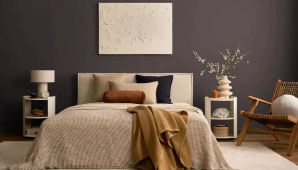
Paint brand Dunn-Edwards went with a deeper, luxurious brown anchored by a plum undertone called French Press Coffee. And C2 Paint has gone with Pueblo, a shifting, neutral purpley pink brown that, as the company says, appears “rosy and botanical in daylight” but becomes “deeper, warmer and more earthen as evening falls.”
Even warmer is Deep Rooted, an inviting earthy orange, that is Dutch Boy’s 2027 Color of the Year.
Soothing but not sleepy blues
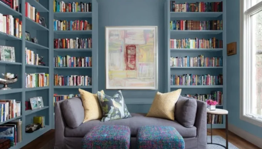
Paint brands Glidden, Valspar and Clark + Kensington have all selected midtone blues as their 2027 choices. Valspar’s Cottage Door is versatile, warm blue gray. Glidden’s choice is a smoky aqua-blue called Artifact. And Clark + Kensington’s Vantage Point, is a timeless blue with hints of violet.
A gradation of greens
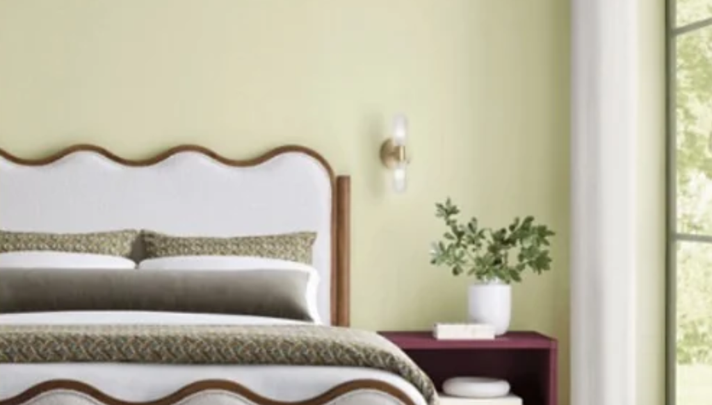
Casual News Now’s Bringle noted a move toward muted, mossy sagey greens in outdoor furnishings during the fall High Point Market, a trend we’re seeing in interiors too.
Paint brand Sherwin-Williams’ Celery pick for 2027 is an “airy, herbal” green with a balanced, wellness vibe. Behr went darker with a mossy olive green with brown undertones called Grounded.
Mood matters too
Those aren’t all the Colors of the Year announced thus far and the color experts at Pantone are typically among the last to release their pick. Pantone’s choice is usually announced in early December. Its forecasters caused a stir – and earned some criticism – when they chose “a lofty white” called Cloud Dancer for 2026.
But Colors of the Year released so far provide a sense of coming color directions. And the language brands use to describe these colors matters also: There’s much talk about balance, warmth, connection, tranquility and timelessness. These are colors that reassure, rather than challenge.
All of this dovetails with what Rachel Fasciani, editor-in-chief of sister publication Design News Now, noted earlier this year when talking with interior designers and home furnishings brands about color directions.
“Their answers weren’t about one shade. They were about mood,” Fasciani said. “Color is getting warmer. Richer. Bolder. More saturated. More immersive. Blues and greens are holding their ground, while chocolate, caramel, ochre, oxblood, terracotta, yellow and even the once-reviled purple are pushing their way into the conversation.”